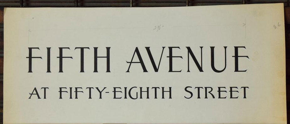
A few years ago I was browsing Etsy and happened upon some nice lettering on what looks like handmade sign. The style really caught my eye, and I thought it might make a good all-caps font. It’s interesting how the letters on the first row are very uniform, while the second row lacks the same precision, especially in the “G”, the “S”, and the “R”. Turning it into a full alphabet would be fun.
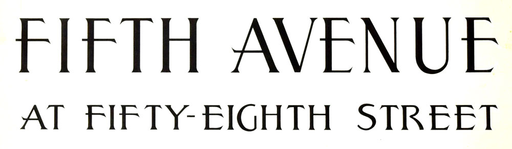
The first thing I did was increase the contrast to make the edges of the letters easier to distinguish:
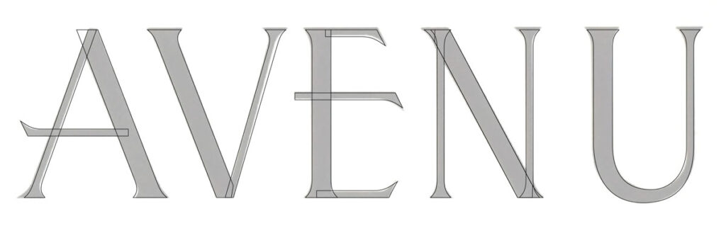
Then I started making the building blocks, and using those blocks to construct the letters that followed:

It started to get fun when the letters got more complex. I used my building blocks as sources of truth, and some visual rules began to form for this font.
The letters I completed first became the foundation for those that followed. I tended to tackle the easiest ones first. Looking at the lower row, I probably made the B by starting with F, and the L by borrowing from the I and the F. I’m not sure I had a system. I was just doing what seemed interesting.
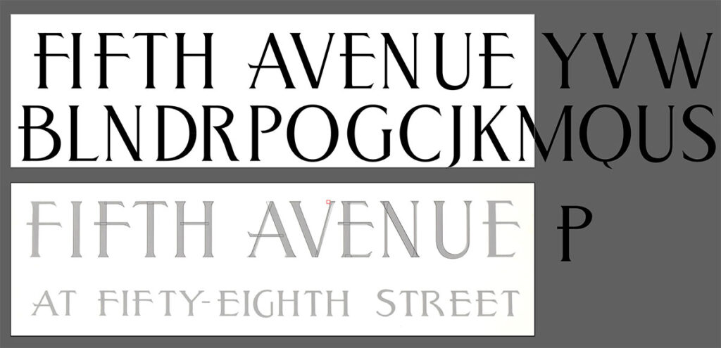
I arranged these letters and liked what I saw. I wanted to make sure I was doing something worthwhile before moving forward.

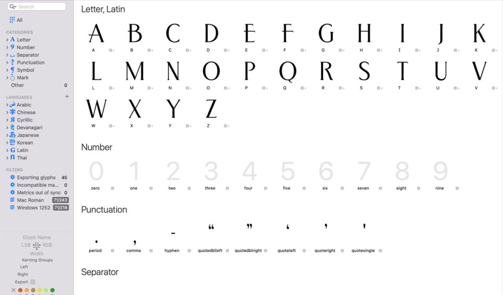
Then I moved everything from Illustrator to Glyphs. I put all the letters on a shared baseline, and then copy them in batches. For example, I will copy ABCDE, and paste those 5 characters into each glyph space very quickly. I delete the ones that don’t belong, which leaves the glyph populated with the letter I want to keep. Doing it that way, I don’t have to mess with a grid structure, and I still maintain a uniform baseline and size consistency between all the glyphs. I don’t worry about the sidebearings when I’m pasting things in. That will take care of itself later on.

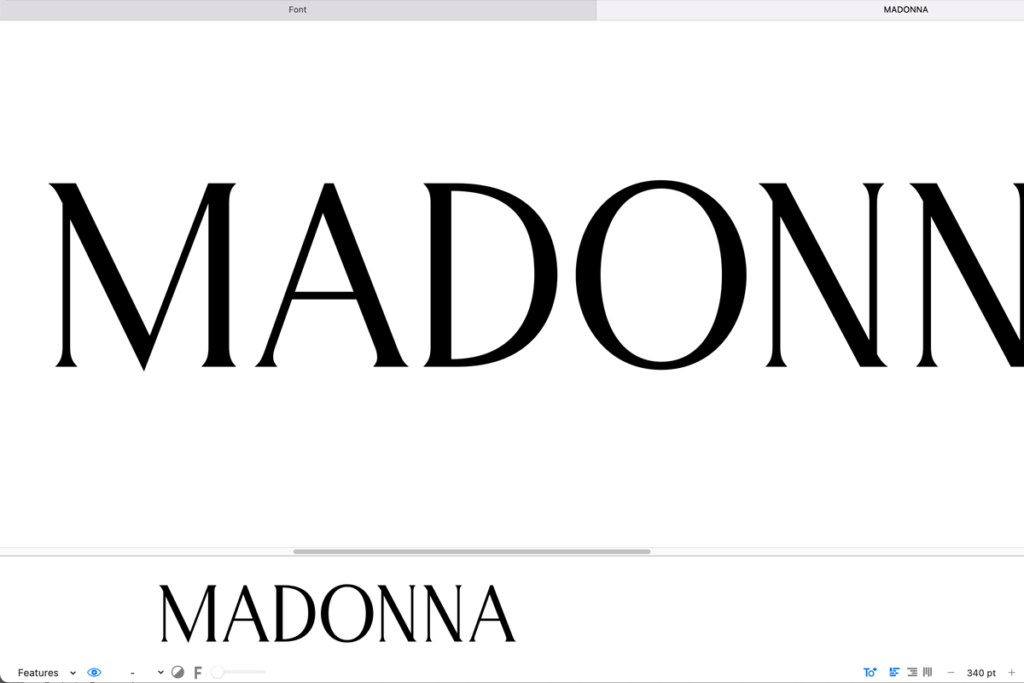
Once the uppercase letters are all in place, I can start testing. I add some punctuation to make things a little easier.
Then I start testing and tweaking
This is the paragraph